LAB SESSION 3
NUMERICAL
PRESENTATION OF UNIVARIATE DATA
INTRODUCTION: The basic idea of descriptive statistics is to describe a set of
data in a variety of abbreviated ways.
In this lab you will investigate measures of central tendency and dispersion.
The box-and-whiskers display, a
graphical display of the 5-number summary of a set of data, will also be
introduced.
MEASURES OF CENTRAL TENDENCY
AND DISPERSION
Measures of central tendency and variation are the
foundation of descriptive statistics but most of these formulas are quite
tedious to compute, even with a calculator.
Fortunately, we can find a number of commonly used descriptive
statistics using just a single command.
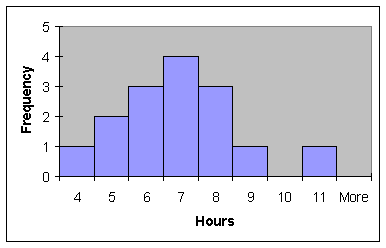
Enter the data in Exercise 2.66 into column A.
Get a histogram of your data and visually
approximate the "center".
Calculate the mean (and
median) using the following commands.
Activate a cell for the answer, then continue with:
Choose: Insert
function, fx > Statistical > AVERAGE (or MEDIAN)> OK
Enter:
Number 1: (A2:A16 or select cells)
|
mean |
median |
|
6.933333 |
7 |
We
can also compute the midrange by using the statistical functions MAX and
MIN
as follows:
select a cell to hold the result, then click in the
formula box and type (selecting
the appropriate statistical function - shown in
bold)
.5*(MAX(A1:A15)+MIN(A1:A15))
|
midrange |
|
7.5 |
Visually locate the three
calculated centers on the histogram.
Notice the three measures of central tendency are approximately the same. How well did you visually approximate the
center?
Now, place the values of
hours of sleep (column A) plus 4 into column B, do a histogram, visually locate
the 'center', then determine the mean, median and midrange.
|
mean |
|
10.93333 |
|
median |
|
11 |
|
midrange |
|
11.5 |
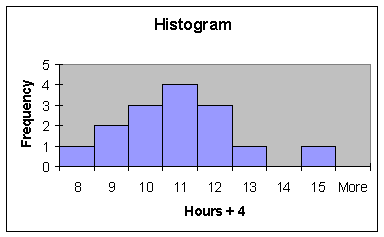
How did the three measures
of central tendency (mean, median, and midrange) change?
Next, place the values of
column A times 3 into column C, and follow the procedure above.
|
mean |
|
20.8 |
|
median |
|
21 |
|
midrange |
|
22.5 |
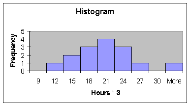
Compare the three measures
of central tendency for the columns of data A, B and C. How and why did a change in the measures
occur? If a different transformation
was performed (such as dividing each entry in A by 2) could you make an
educated guess about the effect on these three measures?
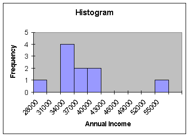
Consider Exercise 2.61 in
the text. Retrieve the data (App02-02),
do a histogram and calculate the mean, median and midrange. What is there about the distribution of
these ten data values that causes these three averages to be so different?
|
mean |
|
35400 |
|
median |
|
33375 |
|
midrange |
|
39750 |
|
mode |
|
31500 |
Compare the standard
deviations for each of the previous four examples, along with how similar or
how different the three measures of central tendency were. Can we use the standard deviation to predict
whether we expect these three measures of central tendency to be quite similar
or quite different?
FREQUENCY DISTRIBUTIONS
When the sample data are in
the form of a frequency distribution, we can still use Excel to describe the
distribution. The class marks need to
be listed in one column with the corresponding frequencies in another. Start a new Excel workbook. (Choose: File > New > Workbook), and enter the following information, where X represents the
number of radios in a household and Frequency
is the number of households having X radios:
X Freq
1 20
2 35
3 100
4 90
5 65
6 40
7 5
Name column A as Radios, and
B as Frequency. Create column C to be
x*f and
D to be x2*f as
follows:
Activate C2
Enter: =A2*B2
Drag: Bottom right corner of C2 down to give other products
Activate D2 and repeat above
commands replacing the formula with =A2*C2
Activate the data in columns
B, C and D.
Choose: AutoSum
To find mean, activate E2,
then continue with:
Enter: =(C9/B9)
To find the variance,
activate E3, then continue with:
Enter: =(D9-(C9^2/B9))/(B9-1)
To find the standard
deviation, activate E4, the continue with:
Enter: =SQRT(E3)
*Reminder: in the case of a grouped
frequency distribution enter the class marks in one column and the
corresponding frequencies in another.
BOX-AND-WHISKER DISPLAY
The boxplot (Excel's name
for the box-and-whisker display) is a simple graph that gives a graphic
5-number summary. Information about the
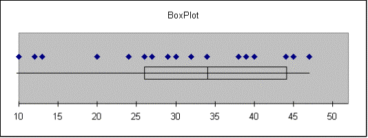
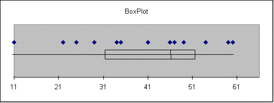
center, dispersion, and skewness of a data set will be illustrated. Retrieve the data for Exercise 2.18
(EX02-018) and construct a boxplot for each of columns A, B and C (Aaron, Ruth
and Maris).
Choose: Tools > Data Analysis Plus >
BoxPlot > OK
Enter: A2:A24 or select cells > OK
|
Aaron |
|
|
|
|
|
|
|
|
|
|
|
|
Smallest = 10 |
|
|
|
|
|
|
|
|
|
||
|
Q1 = 26 |
|
|
|
|
|
|
|
|
|
|
|
|
Median = 34 |
|
|
|
|
|
|
|
|
|
||
|
Q3 = 44 |
|
|
|
|
|
|
|
|
|
|
|
|
Largest = 47 |
|
|
|
|
|
|
|
|
|
||
|
IQR = 18 |
|
|
|
|
|
|
|
|
|
|
|
|
Outliers: |
|
|
|
|
|
|
|
|
|
|
|
|
|
|
|
|
|
|
|
|
|
|
|
|
|
|
|
|
|
|
|
|
|
|
|
|
|
|
|
|
|
|
|
|
|
|
|
|
|
|
|
|
|
|
|
|
|
|
|
|
|
|
|
|
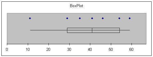
Ruth |
|
|
|
|
|
|
|
|
|
|
|
|
Smallest = 11 |
|
|
|
|
|
|
|
|
|
||
|
Q1 = 31.5 |
|
|
|
|
|
|
|
|
|
|
|
|
Median = 46 |
|
|
|
|
|
|
|
|
|
||
|
Q3 = 51.5 |
|
|
|
|
|
|
|
|
|
|
|
|
Largest = 60 |
|
|
|
|
|
|
|
|
|
||
|
IQR = 20 |
|
|
|
|
|
|
|
|
|
|
|
|
Outliers: |
|
|
|
|
|
|
|
|
|
|
|
|
|
|
|
|
|
|
|
|
|
|
|
|
|
|
|
|
|
|
|
|
|
|
|
|
|
|
|
|
|
|
|
|
|
|
|
|
|
|
|
|
|
|
|
|
|
|
|
|
|
|
|
|
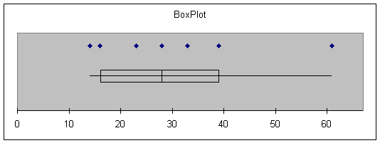
Maris |
|
|
|
|
|
|
|
|
|
|
|
|
Smallest = 5 |
|
|
|
|
|
|
|
|
|
||
|
Q1 = 13 |
|
|
|
|
|
|
|
|
|
|
|
|
Median = 23 |
|
|
|
|
|
|
|
|
|
||
|
Q3 = 33 |
|
|
|
|
|
|
|
|
|
|
|
|
Largest = 61 |
|
|
|
|
|
|
|
|
|
||
|
IQR = 20 |
|
|
|
|
|
|
|
|
|
|
|
|
Outliers: |
|
|
|
|
|
|
|
|
|
|
|
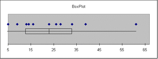
A rectangle is constructed
between the two quartiles, with a line across the box indicating the location
of the median. The box encloses the
middle half of the data. The whiskers
extend in either direction to indicate the maximum and minimum values.
Although “side-by-side”
BoxPlots cannot be constructed in Excel, we can generate BoxPlots with the same
scale for better comparison of the distributions. Activate all of columns A, B and C, then
Choose: Tools
> Data Analysis Plus > Box Plot > OK > OK
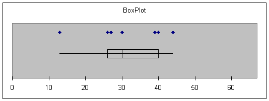
Consider again the salary
data presented in Application 2 - 2.
Retrieve the data from the Student Suite CD and perform a BoxPlot of the
data in column A.
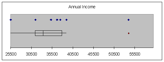
The red oval in the boxplot
indicates an outlier- a data value that is far removed from the rest of the
data.
ASSIGNMENT: