LAB SESSION 4
PRESENTATION OF BIVARIATE DATA
INTRODUCTION: It is frequently interesting
to view the relationship of two variables.
In this lab we will see how Excel can help us plot bivariate data and
discover some trends in the relationship.
We can set up the data as ordered pairs, with the independent variable
as the x and the dependent variable as the y.
TABULAR
PRESENTATION OF BIVARIATE DATA
We can arrange the data
resulting from two qualitative variables in a cross tabulation or contingency
table. These tables often show relative
frequencies (percentages) that can be based on the entire sample, or on the
subsample classification (either a row or a column).
Let’s use the data in the
Highway Speed Limits table in Exercise 3.13.
Retrieve the data (EX03-013).
Note the data is arranged as follows: Column A is titled State. Column B
is titled Cars, and column C is titled Trucks.
We need to associate a vehicle type with each value in columns B and C,
and to declare the values as “text” rather than numeric. Insert a column in front of column B, type
“Cars” in the new B2 cell, and drag right corner down to fill. Likewise, insert a column in front of column
D, and fill with “Trucks”. Also, the
data (vehicle type and speed) must all be contained in two columns, so copy
columns D and E and paste to the end of columns B and C.
To construct a
cross-tabulation table of the two variables, vehicle type and maximum speed
limit:
Choose: Data > Pivot Table and Pivot Chart
Report . . .
Select: Microsoft Excel list or database >
Next
Enter: select appropriate cells of columns B
and C > Next
Drag: Headings to row or column
One heading
into data area
|
Count of Vehicle |
Speed Limit (mph) |
|
|
|
|
|
|
Vehicle |
55 |
60 |
65 |
70 |
75 |
Grand Total |
|
Cars |
2 |
|
22 |
16 |
10 |
50 |
|
Trucks |
7 |
3 |
20 |
11 |
9 |
50 |
|
Grand Total |
9 |
3 |
42 |
27 |
19 |
100 |
Now let’s do the same thing, only this time select the summarize by total percent.
Double Click: Count of Vehicle in data area box;
Choose: Summarize by: Count > Options
Show data as: % of total > OK
|
Count of Vehicle |
Speed Limit (mph) |
|
|
|
|
|
|
Vehicle |
55 |
60 |
65 |
70 |
75 |
Grand Total |
|
Cars |
2.00% |
0.00% |
22.00% |
16.00% |
10.00% |
50.00% |
|
Trucks |
7.00% |
3.00% |
20.00% |
11.00% |
9.00% |
50.00% |
|
Grand Total |
9.00% |
3.00% |
42.00% |
27.00% |
19.00% |
100.00% |
SCATTER DIAGRAMS
To do a scatter diagram
illustrating the relationship between two quantitative variables we will enter
the data into two columns. For this
illustration, the data from Table 3-10 will be used (TAB03-10).
The x-variable (push-ups) is
in column A, and the y-variable (sit-ups) is in column B. Continue with:
Choose: Chart Wizard > XY(Scatter)
> 1st picture > Next
Enter: Data Range: A1:B11 or select cells > Next
Choose: Titles
Enter: Chart title: Physical Fitness
Value (x) axis:
Push ups
Value (y) axis:
Sit ups > Finish
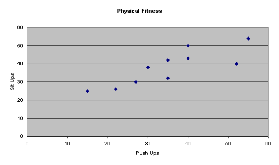
For the person(s) that did
35 push-ups, how many sit-ups were they able to do?
How many push-ups and
sit-ups were done by the person represented by the dot in the upper right
corner?
To compare these two
variables in a different way, lets do a box-and-whisker display with common
scale:
|
Push_Ups |
|
|
Smallest = 15 |
|
|
Q1 = 25.75 |
|
|
Median = 35 |
|
|
Q3 = 43 |
|
|
Largest = 55 |
|
|
IQR = 17.25 |
|
|
Outliers: |
|
|
|
|
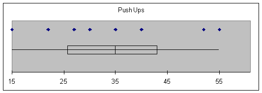
|
Sit_Ups |
|
|
Smallest = 25 |
|
|
Q1 = 29 |
|
|
Median = 39 |
|
|
Q3 = 44.75 |
|
|
Largest = 54 |
|
|
IQR = 15.75 |
|
|
Outliers: |
|
|
|
|
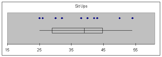
Compare the two types of
exercises. Which indicates greater
range of ability? Which exercise do
most of those sampled find more difficult to do (as measured by number done)?
ASSIGNMENT: Do Exercises 3.18, 3.25 in
your text